 PACS
Desktop Viewer
PACS
Desktop Viewer
PACS
Desktop Viewer
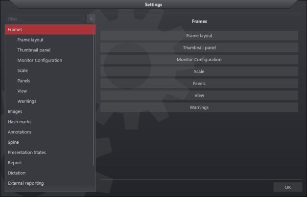
The Frames page contains the settings that can be used to configure monitors, customize the thumbnail panel, overlays and frame layouts. It also contains settings to configure the independent pop-up panels such as reports, patient folder and the DICOM information panel. Each section is described below.

Selecting the Frame Layout section opens a Frame Layout settings:
| Frame Layout Settings | Default | Description (also located on panel) |
| Icon Size | 28 | Base icon size. Determines the toolbar icons, font size, and scales everything. Monitor dpi settings can change the true size |
| Overlay Icon Size | small | Relative size of the overlay image frame icons (e.g. relevancy of image, link, key image, etc.) |
| Image Frame Drag Area Size | Same size | Size of the draggable area at the top of the image frame relative to the overlay icons |
| Image Frame Scroll Area Size | 16 | Size of the left mouse click to scroll area in percentage of the image width |
| Orthogonal Image Position | Bottom right | Orthogonal image position in the image view |
See : Localizer Lines and Hash Marks
The thumbnail panel settings contains a subset menu with four customization tabs:
General Settings
| Thumbnail General Settings | Default |
Description |
| Thumbnail Panel Size | Medium | Relative size of thumbnail panel. Larger panel can show more information, but occupies more space |
| Thumbnail Panel Location | Top | The location is the same for all monitors configured to display the thumbnail panel. Thumbnail can be horizontal or vertical. |
| Number of Image Columns/Rows | 1 | Thumbnail can be placed in multiple columns or rows |
| Show Scrollbar Tool Tip | Disabled | Hover over scrollbar to display extra information |
Overlay Information
| Thumbnail Information Settings | Default | Description |
| Thumbnail Header | Enabled |
Information panel above the thumbnail image. The header text can be configured in overlay text settings |
| Thumbnail Footer | Disabled | Information panel below the thumbnail image. The footer text can be configured in the overlay text settings |
| Thumbnail Top Information | Disabled | Information text on the top portion of thumbnail image. Text can be configured in the overlay text settings |
| Thumbnail Bottom Information | Enabled | Information text on the bottom portion of thumbnail image. Text can be configured in the overlay text settings |
Images
| Thumbnail Images Settings | Default | Description |
| Show Images For Processing | Disabled | Include DICOM For-Processing images in thumbnail panel |
| Show Document Thumbnails | Enabled | Display DICOM image objects marked as scanned documents (ConversionType=WSD) in the thumbnail panel |
| Show Presentation Thumbnails | Disabled | Display presentation state objects as independent series in the Presentation Group section of the thumbnail panel |
| Show Key Image Thumbnails | Enabled | Display key images as an independent series in the Presentation Group section of the thumbnail panel |
Visibility
| Thumbnail Visibility Settings | Default |
| Thumbnail panel is visible on monitor #1 | Enabled |
| Thumbnail panel is visible on monitor #2 | Enabled |
Note: This area will adjust according to the number of monitors available. For example the Thumbnail panel is visible on monitor #3, 4, 5, etc.
See: Thumbnail Panel
The monitor settings contain options for designating a primary monitor for the viewer:
| Monitor Settings | Default | Description |
| Primary Monitor | Monitor #1 | The selected monitor is the primary monitor, and will display any viewer prompts, thumbnail panel, and other functions |
| Display Viewer on monitor #1 | Enabled | N/A |
| Display Viewer on monitor #2 | Enabled |
N/A |
Note: This area will adjust according to the number of monitors available. For example, the Display Viewer on monitor #3, 4, 5, etc.
In this area, the user is able to change the size of text, icons and other items.
| Monitor dpi Settings | Default |
| Monitor #1 dpi | 96 |
| Monitor #2 dpi | 96 |
Note: This area will adjust according to the number of monitors available. For example Monitor dpi #3, 4, 5, etc.
This area allow the user to customize where the independent pop-up panels are displayed on the viewer.
| Panels Settings | Default | Description |
| DICOM Info Panel Always on Top | Disabled | Keep the information panel displayed on top of other windows |
| Report Panel Always on Top | Disabled | Keep the report panel displayed on the top of other windows |
| Automatically Open Report Panel | Disabled | Automatically open report panel when study opened |
| Patient Folder Always on Top | Disabled | Keep the patient folder displayed on top of other windows |
| Automatically Open Patient Folder | Disabled | Automatically open patient folder when study opened |
| Print Panel Always on Top | Disabled | Keep the print panel displayed on top of other windows |
See: Independent Pop-up Panels
The View Settings contains a subset menu of four customization tabs:
Color
| Color settings | Description |
| Show color settings | Opens legacy Color settings page |
Controls
| Controls Settings | Default | Description |
| Cyclic Image Scrolling | Disabled | Loop around to the first image when scrolling reaches the last image |
| Keep The Cursor | Enabled | When enabled, the cursor mode persists after applying the function. When disabled, cursor mode returns to normal mode |
Image View
| Image View Settings | Default | Description |
| Show Orientation Information | Disabled | Display orientation markers in the center of each side of the image |
| Stack Ruler | No ruler | Stack ruler shows the position of the displayed image within a stack of images |
Image Panel
| Image Panel Settings | Default | Description |
| Center Zoom Region | Enabled | The center zoom region setting defines the focal point location when establishing a zoom region. When enabled, the location of the cursor, when you first click is set as the center of the defined region. When disabled, the location of the cursor when you first click is set as the corner of the defined region |
| Persistent Frame Settings | Enabled | Frame settings remain applied after dropping a new thumbnail set into an initialized image frame |

| Warnings Settings | Default | Description |
| Image Removed from Printer Panel | Enabled |
Show warning when an image is removed from the printer panel |
| Image Removed from Grid Panel | Enabled | Show warning when an image is removed from the grid panel |
| New Image or Series Removed from Study | Enabled | Show warning when an added image or series is removed from the study |
| Hanging Protocol Remove | Enabled | Show warning when a hanging protocol is removed from the hanging protocol list |
| Window Level Remove | Enabled | Show warning when a custom defined window/level is removed from the window/level list |
| Annotations Remove | Enabled | Show warning when all annotations is removed |
| Viewer Sign Off | Enabled | Show warning when the viewer is signed off |
| Permanent Record | Enabled | Show warning when a permanent record is selected |
| Dictate to Addendum | Enabled | Show warning when trying to dictate to approved report |
| Delete Macro | Enabled | Show warning when a macro is deleted |
| Referenced Images | Show message box | Referenced image not found message box uses the following warning (select from dropdown) |